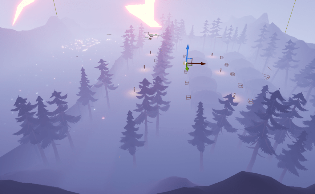
I was not happy with how the arena of the boss fight looked. It was a nice idea to have it up in the sky looking down at the flowers and tombstones. But in the end it was a boring glass box. The feeling of fighting there wasn’t what I wanted. I scrapped the entire arena along with some stuff connected to it. I shifted the necessary objects down to the graveyard below. The fight will take place here instead. I needed to add a wall to the side so the player couldn’t escape. I wanted the wall to not be present during the main exploration of the level, but I couldn’t change its collision during runtime. It has something to do with how the wall spline was built.
I realized it may actually be better to have the graveyard not seen by the player until the boss fight itself. That way the impact of seeing it for the first time hits all at once. So the wall effectively cuts the level in half, and the player has less to explore. At least this means the area can be tighter and give more depth than breadth.
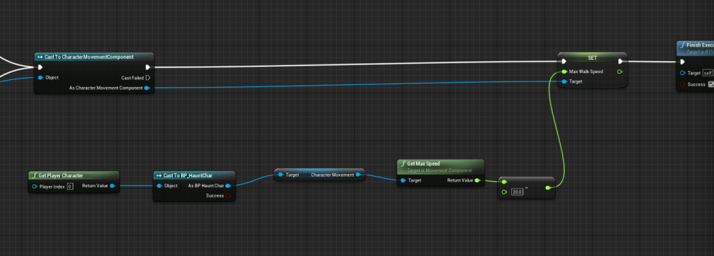
In the house I moved some things around. I slowed the dog down so the player wouldn’t be kicking them in the face when they walked together. Added more lights in the area since the wall cut off a big portion of the map.
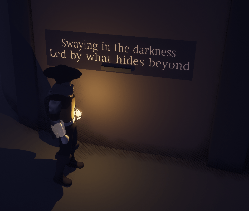
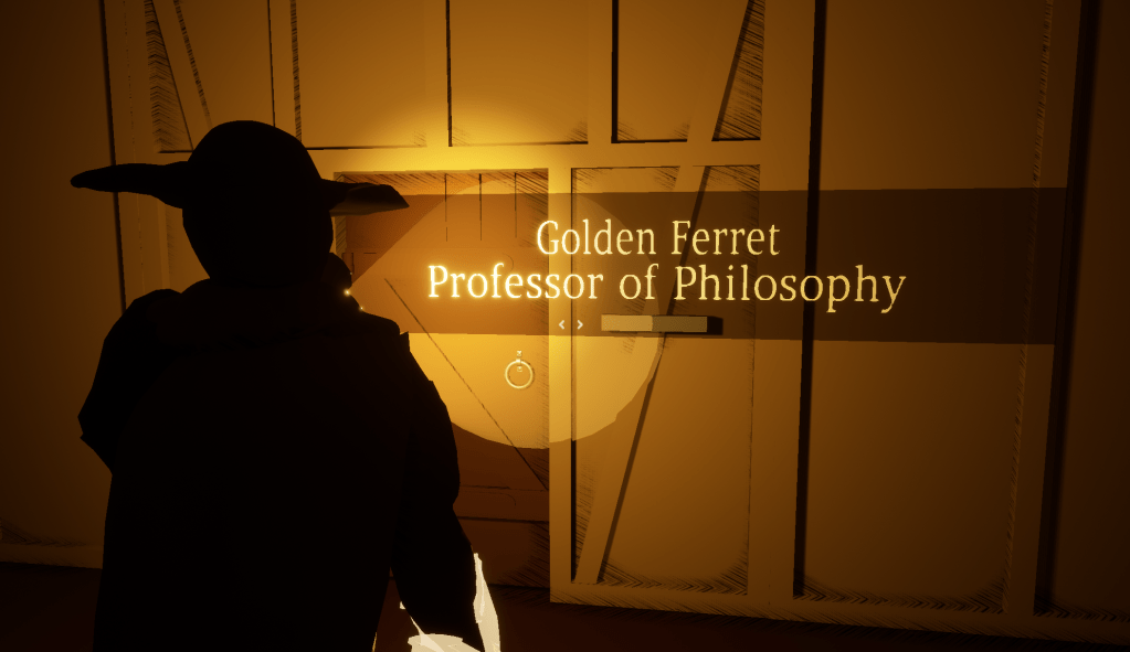
Did some research online on how to use a custom font for the text render. It was very simple and easy to follow. I could already use the default font that I was using for everything in the game. I had to create a separate font asset and then plug it into the text renderer. It looks a lot nicer especially because it matches the font I am using for the game. I tested it in this level and also the first level to make sure nothing goes off the edges or is unreadable. Some of them were misaligned so I adjusted them.
I have an asset lined up for the boss, but I still need to purchase it. Before that I will probably do some UI improvements first.


