
I am not a great vector artist, and nowhere near a good UI artist. Today I spent the time creating new UI images for the game using Inkscape. Some I am happy with, others I am only okay with. Since I am new to the program it took awhile for me to get used to. I was using my 6-year-old tablet and my not so great sketching skills to draw.
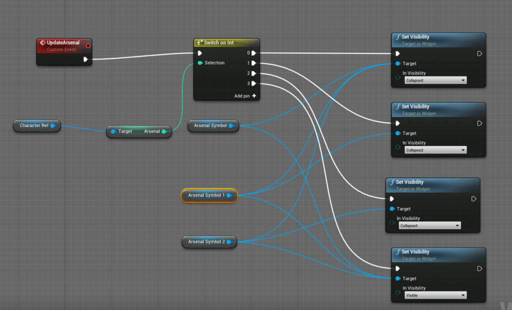
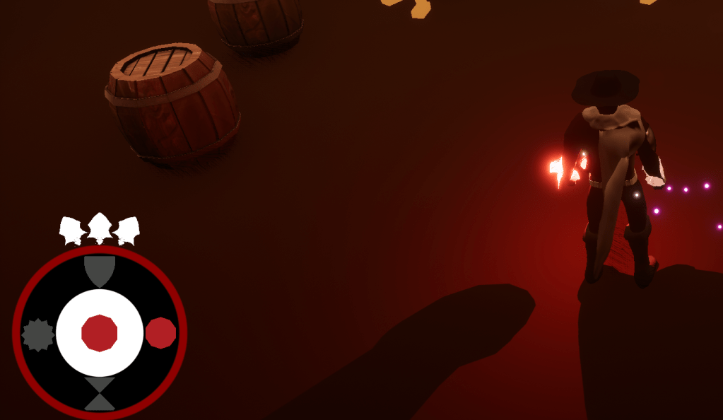
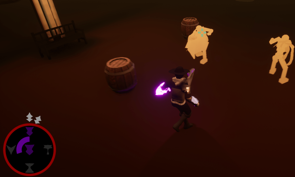
The first new element I added was for the Arsenal power. It shows the three charges about the resource bar. It was simple to make sure that it disappeared one by one until it was empty. On the resources I also added a black background to it, so the visibility of the images would be clearer. Then I started creating new symbols for all the powers. I needed them to be distinct so the player could tell them apart from each other. I tested a few different looks for the powers, and these may not be their final looks. At least I know the flow of how I want to create these images.
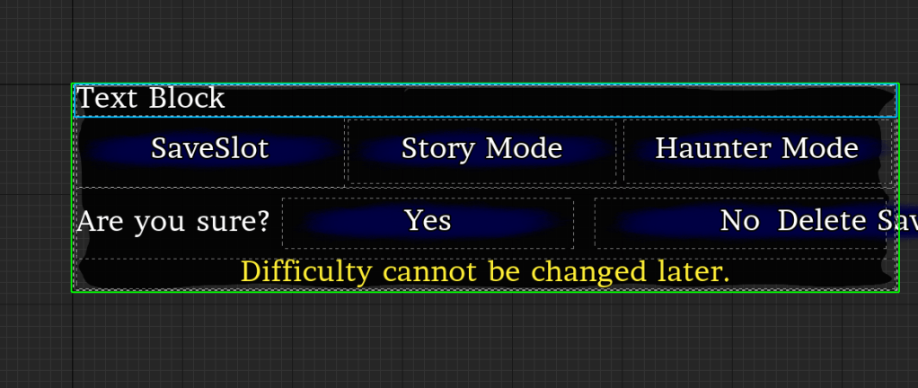
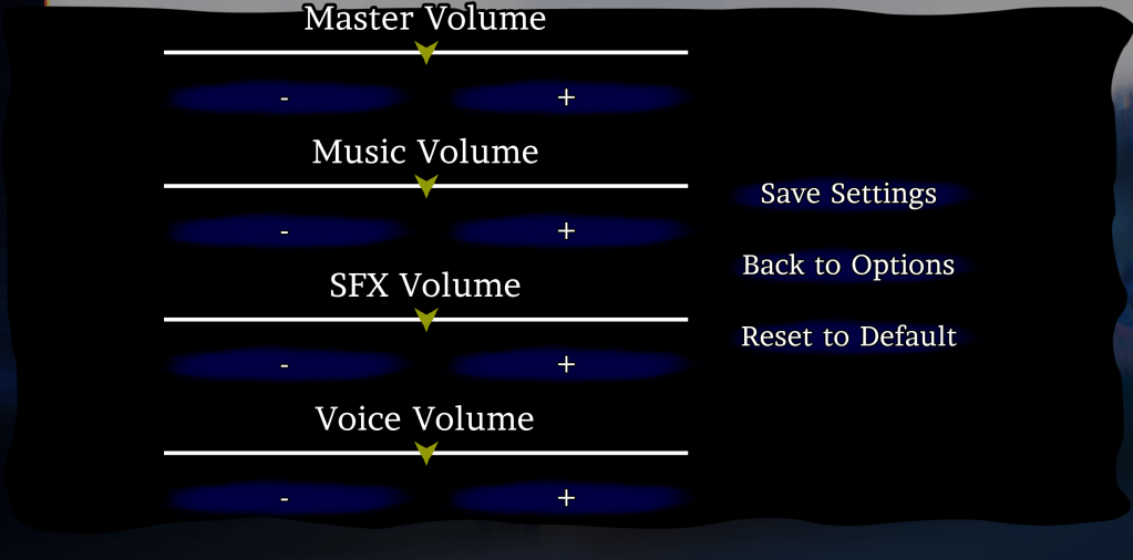
Once the power elements were done I created new backgrounds for the menus and button. The plain square background just wasn’t doing it for me. I created something that looked slightly like dilapidated paper. Again, I will probably not keep this one but it is a step in the right direction. The background I created for the button I will probably keep. The previous image I was using looked better for in-game pop-ups or messages. The button needed a more solid foundation if that makes sense.
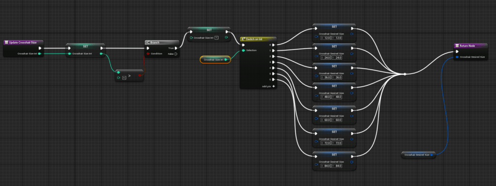
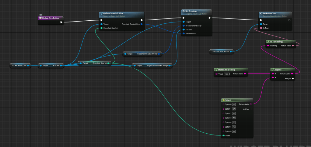
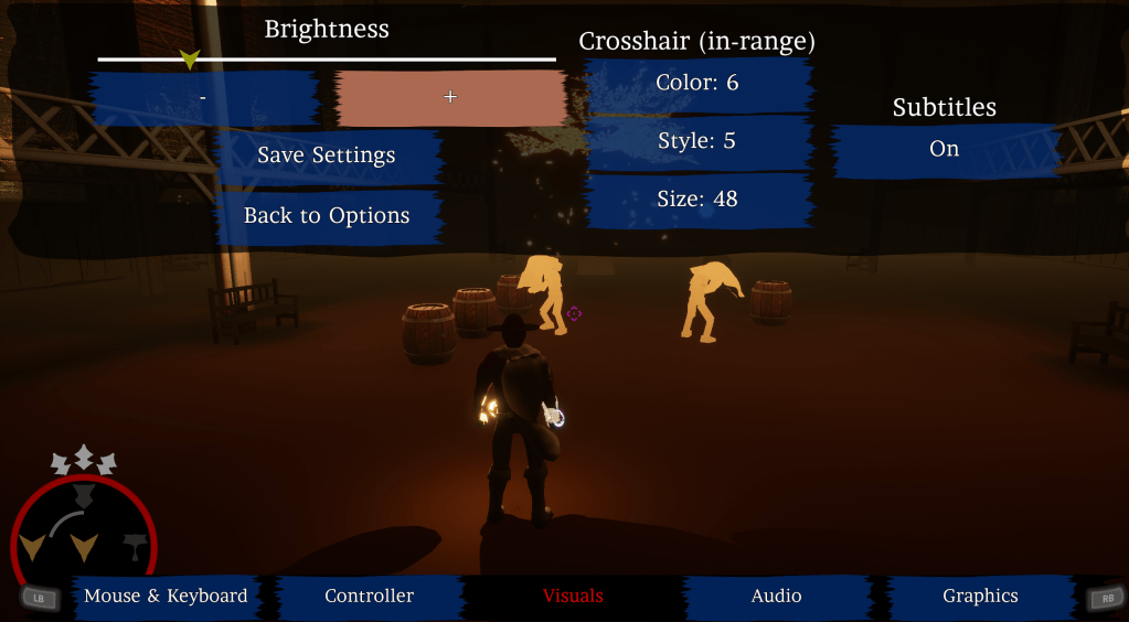
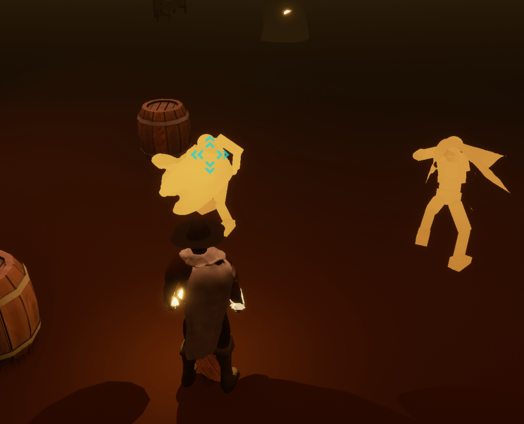
After I looked at the menus I realized I wanted to change the size of the crosshair. Instead of having only one crosshair size I added a setting so people could pick between 7 available sizes. The default is the size I prefer, and it can go really big or very tiny. I used the previous crosshair settings as a template for this new setting. Then I made sure the crosshair on the target lock-on used the same size that the player set it to.
Tomorrow I might finally get the animation I need for the boss then I can start working on its fighting pattern.
